When you build landing pages, every detail counts and increases conversion rates. One such detail that can truly elevate your website's aesthetics is the clever use of gradients and outlines.
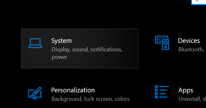
Nuxt and Nuxt UI have an awesome gradient on hover effect, which Windows 10 also had in their settings UI:
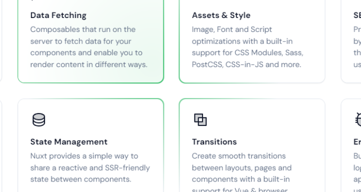
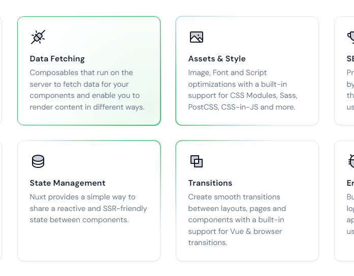
Here is the effect on the Nuxt page ( https://www.nuxt.com/ ):
Building this kind of effect requires some JavaScript. In this tutorial, I show you how to create it!
How it works
The effect works by JavaScript setting some CSS properties on a DIV element.
The properties are --x and --y. Then the DIV has a before: element with the gradient.
That before element has an empty content, with an absolute position, using the full width and height of the DIV.
Now, JavaScript calculates the --x and --y based on your mouse position distance to the top left corner of the DIV element.
This is used to place the gradient at the right position.
Now you may wonder how the gradient is only an outline when we set the whole background.
That works by adding another DIV inside the DIV with a white background. The before: element is positioned slightly bigger than the main DIV, so an outline gets visible.
Now, when you hover the background gets visible. How is that done? Well, its just a background opacity which gets set on hover.
Setting up a basic project
For this tutorial, I use vanilla JavaScript in the online code environment, https://codepen.io/. You can build it with any other JavaScript framework and CSS framework, or without any framework at all too!
HTML
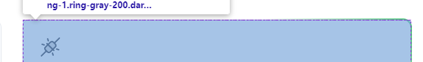
The HTML for this project is kind of simple, it's just two DIVS with your content inside.
Here is the base outline:
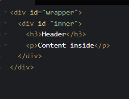
<div id="wrapper" style="--x: 20px; --y: 20px;">
  <div id="inner">
    <h3>Header</h3>
    <p>Content inside</p>
  </div>
</div>
CSS
The CSS is also simple for the wrapper and its inner DIV, but gets more complicated for the before: element of the wrapper, as this also contains the gradient logic.
#wrapper:before {
  background: radial-gradient(250px circle at var(--x) var(--y), #40c371 0,transparent 100%);
  will-change: background;
  content: '';
  display: block;
  position: absolute;
  left: -2px;
  top: -2px;
  width: calc(100% + 4px);
  height: calc(100% + 4px);
  z-index: -1;
}

#wrapper {
  width: 300px;
  height: 200px;
  position: relative;
}

#inner {
  background-color: white;
  height: 100%;
}
The wrapper is just absolute positioned without any content, and contains the background. It is slightly bigger than the wrapper DIV, which makes it appear to be an outline.
JavaScript
To make this effect now finally work and be interactive, we need some JavaScript magic:
const wrapper = document.getElementById('wrapper');
const rect = wrapper.getBoundingClientRect();

document.addEventListener('mousemove', (e) => {
  const x = e.pageX;
  const y = e.pageY;

  const diffX = x - rect.x;
  const diffY = y - rect.y;

  wrapper.style = `--x: ${diffX}px; --y: ${diffY}px;`
}, false);
This works by having a mouse listener, that checks your current mouse position in the whole window. Then we calculate the difference of that to the top-left of the wrapper.
This way, we know where to place the gradient based of the wrapper.
We simply set the gradient position using the CSS, and that's it.

The effect is finished 🙂!